Automatic generation of puzzle tile maps for spatial-temporal data visualization
A reimplementation of the Paper by Lin et al. 2019 by
Andreas Wiesinger (01429087) and Dominik Wolf (0925239)
Note: This page is intended to be read inside the real app with a server in background (npm run serve). Otherwise, the images will not be loaded!
Get Started
The source code and therefore the app are located in src/:
Please open a terminal in the src/ folder and run the following two commands:
npm install
npm run serve
This should download all needed dependencies and then start a server with the app. You can then start the application in a browser at http://localhost:8080/.
Alternatively, the static html should work just fine as well without the need for any server. Just open the file bin/index.html. Some features (like the routing to the About page) might not work without a running server. However, we figured that the tilemap generator works just fine.
If nothing works, you can still just watch the video.
The program
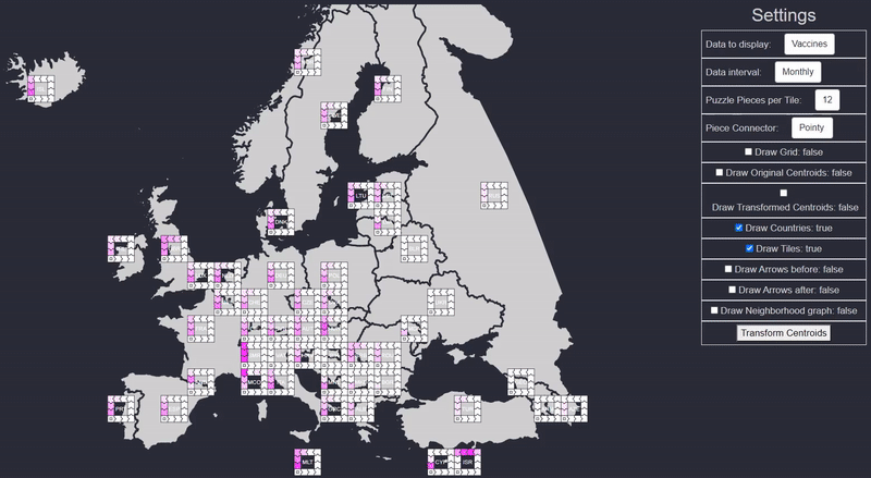
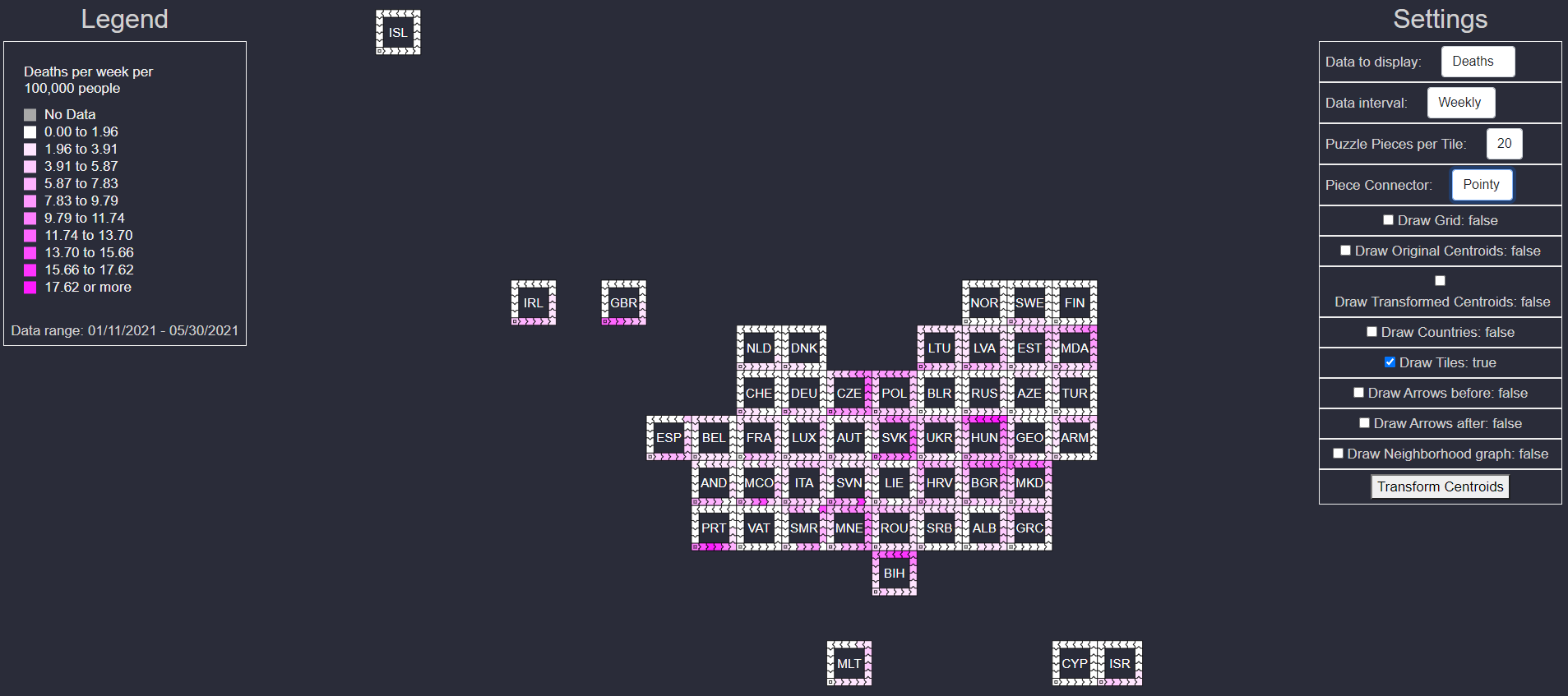
The program has some key features. The most important one is to display equally sized tiles which represent geographical regions in the world. In our case, these regions are the countries of Europe and currently limited to Europe.
Tiles and Puzzle Pieces
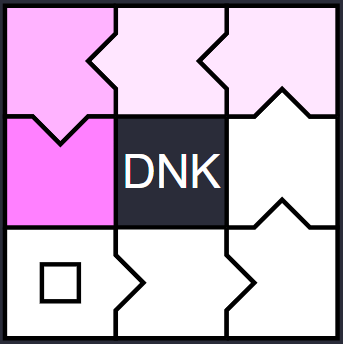
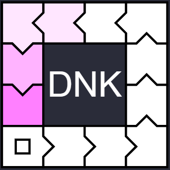


Each tile consists of many puzzle pieces (the amount of pieces can be chosen in the Settings UI). Each puzzle piece represents a time frame. The time range for each piece can also be chosen in the Settings UI. The possible settings are: Daily values per puzzle piece, weekly or monthly. If you choose 12 pieces with daily time interval, you will see the data of the last 12 days in your tilemap. The starting point of the data is the last entry of our dataset backwards. The label in the center of the tile is the iso3 code of the country which is represented by the tile.
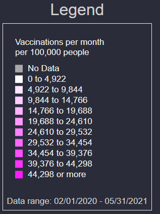
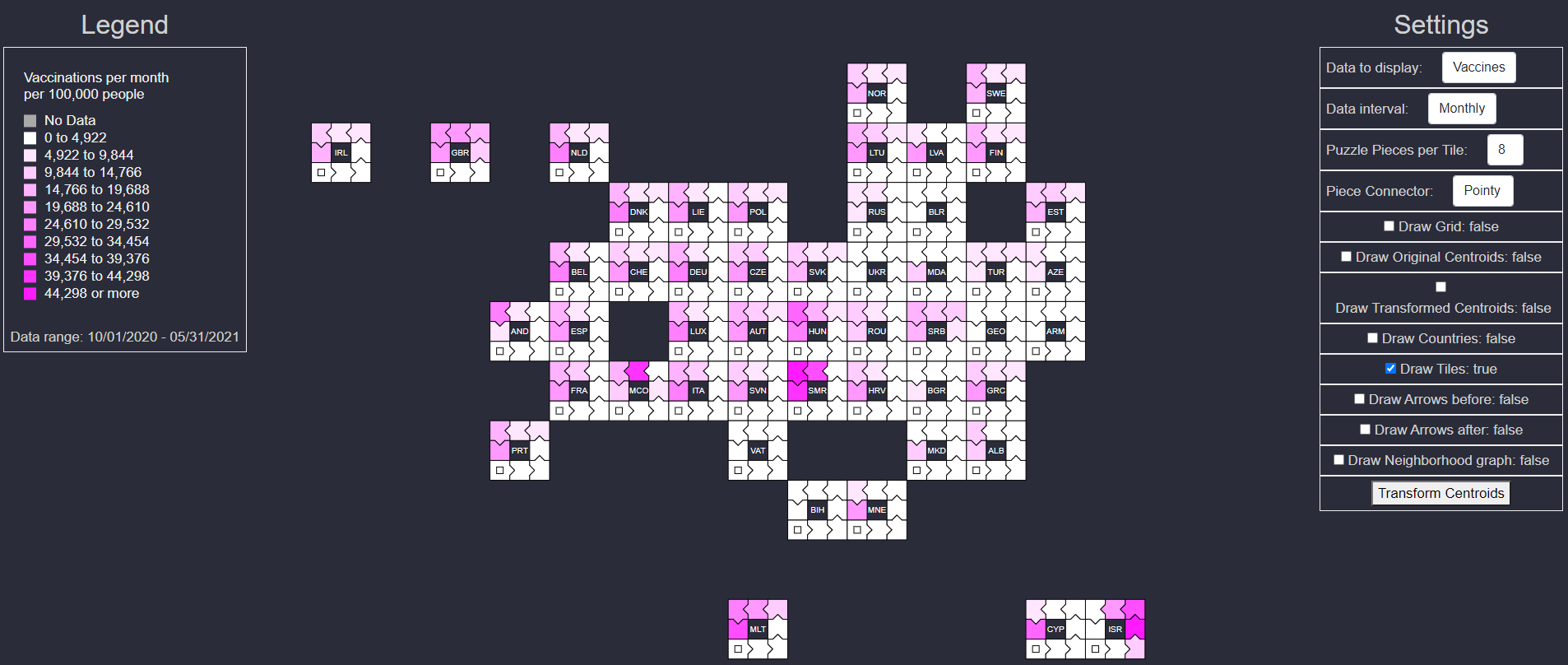
The legend displays the meaning of the color and additional information to the currently active data.
The paper vs. our approach
The tiles are initially placed on top of the calculated centroids of each country. That means, if they do not overlap. Overlapping tiles take an empty cell near their original target location. This initial setup leads to widespread tiles across the map. The original paper used mosaic filtering and tile position correction in a way, that they scaled their grid bruteforce so long until they generated equally as many tiles by counting the pixels in each grid cell, as the amount of regions to be visualized was. This means, they knew how many tiles they needed, but still they did not just place the tiles and re-position them, but they used an algorithm which naturally leads to the same amount of tiles after a few iterations which they claim will then be placed in a good way to still represent the original geographic borders.
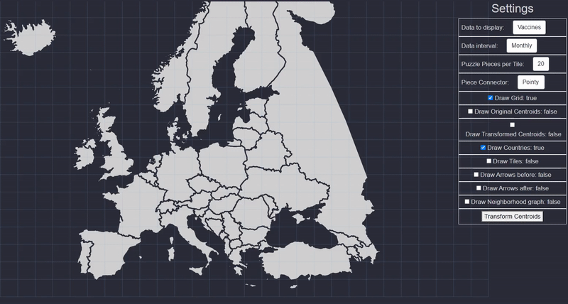
We did not use this exact algorithm for the tile positioning approach: We know the amount of tiles, we also know the neighborhood relationships of the countries (which are needed for the utilized position correction algorithm). Therefore, there is no need to count pixels in each cell and complicatedly iterate over different scale levels until you have (almost) as many tiles as countries. We just place the tiles directly (or at the first empty slot near the direct position) over the countries' centroids.
Tile position Correction
What we did however implement, is the algorithm bei McNeill and Hale from their paper "Generating Tile Maps" from 2017, which was also used by Lin et al. for the position correction. This algorithm transforms every centroid according to their neighborhood relationships and aims to get equidistant positioning while preserving to some extent the relative positions between the centroids. This is especially useful for the tilemap generation because we aim to place equally sized tiles in a way that they still represent the underlying geometry well enough.
The results in the paper of McNeill and Hale can be seen in the following picture. 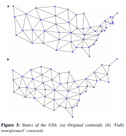
Our own results look similar, but be aware that the neighborhood relations are more complicated for Europe than for the US States. Therefore, it is to be expected that some centroids will swap places during the refinement of their positioning. ![]()
The meaning of the different edges and circles in our graph
Neighborhood edges
The neighborhood edges in grey connect the (transformed) centroids which belong to different countries. These connection lines represent direct neighborhoods of countries in Europe. Islands always stay still during transformation as they have no neighbor countries. Some exceptions are Cyprus and Ireland, which both have a slice of land on their island which belongs to a different country (e.g Turkey and GB), but we did not count those exceptions as true neighbors in order to get a more representative positioning.
Centroids
The blue circles represent the original centroids (see "Draw original Centroids"-Checkbox). These are the middle points of the bounding boxes of the geographical map data. This means, a centroid can lie outside of a country's borders (e.g. Norway). They should help to understand the country mapping to the tiles when the other edges are visible.
The red circles are also the countries' centroids, but the move after each click on the "Transform Centroids" button. These centroids will stay mapped to their original countries. Their position will be used to place the tiles initially and after each transformation. If the countries would then directly be mapped to these tiles, they might end up further away from the original position than necessary. Therefore, Lin et al. applied the hungarian algorithm with a distance-matrix cost-evaluation to them in order to find the best mapping after this placement step.
Mapping
The red edges (see "Draw Arrows before"-Checkbox) represent the mapping of the countries to the tiles before the hungarian algorithm has been applied to them. This means, you can follow how far away a tile is placed from the original centroid's positions. The arrows start at the original centroids and end at the tile's center.
The blue edges (see "Draw Arrows after"-Checkbox) represent the mapping of the countries to the tiles after the hungarian algorithm has been applied to them. Comparing the blue with the red edges shows that some countries need a different mapping in order to have a minimum distance from each country to each tile.
Grid
The grid might or might not help to see the possible placements of tiles. Just a visual helper.
Data preprocessing
We pre-processed COVID-19 data with pandas in python (see src/extras/data_preprocessing.py). This script generates json files which we can load into our Vue application. The data is split into daily, monthly and weekly files, covering all countries in the world.
Interpretation and Discussion of the visualized Data
An evaluation concerning the different modes of the puzzle pieces, color, piece shapes and how they are perceived and recognized by users was made by Lin et al. We therefore skip the elaborate discussion of those aspects.
Our focus of the discussion is the data itself, and how well we realized the tilemap-generator:
In the screenshot above, we can see the vaccinations per month per 100.000 people per country during the past 8 months.
Interesting was for us in this case, that the majority of the countries clearly show an increasing rate of vaccinations during the last months, while Israel is outstanding with their high vaccination rate in early months and decreasing rates in the last few months.
Another thing is the interpolation of our data. In the picture above we can see two things:
1. Austria, Slovakia, Denmark and Cyprus are testing their folks thouroughly.
2. The other countries are also testing their people very well, but because of some outliers and our choice of linear interpolation, we can barely see the test capacity of those other countries.
The deaths on the other hand are more evenly distributed across the countries (the greatest outliers are not so far away from the average), therefore, our linear interpolation results in a good visual representation of the data.
Known Bugs
● Dragging the map might be very glitchy. This feature is not implemented intentionally but a side-effect of some d3 functions.
● Choosing the piece connector sometimes needs two clicks in order to work.
● The website is not adapted for smaller screen widths. Having a small monitor might lead in unaesthetic css styling: Our monitors have a width of 1920 pixels and we assumed this width for simplicity reasons.
● The centroids and edges are unintentionally visible:
1. outside the grid
2. for countries like the Faroe Islands which do not render a tile, because there is no data available, and tiles are only rendered for countries where data is available. This check is not implemented for centroids and edges however.
● The initial loading is a bit laggy. We apologize.
Possible improvements
The start points of the date-range could be chosen by the user: E.g. now it is only possible to display the past X days/weeks/months. What if we would like to see arbitrary 12 sequential days in the dataset?
The grid scale could be chosen by the user: This feature was implemented at the beginning but later made us some difficulties. The tiles would be larger or smaller compared to the underlying map and therefore would impact the placements slightly. However, clicking a few times on the transform button leads to very similar results right now.
Users could choose world regions or country sets by selecting one of many possible regions (E.g. "USA", "Europe", "Asia", "Worldwide", etc.). This needs some more effort as we need to get the neighborhood mapping for the worldwide countries beforehand. Currently those are only available for European countries.
Different interpolation strategies might greatly improve the visualization: As discussed before, outliers currently have negative impact on the resulting tilemap. Users could choose the lower and upper limit of the displayed data and how the data should be interpolated (linearly, logarithmic, etc.).
Better tile positioning:
Currently, we transform tiles with the algorithm by McNeill, which might itself be improved: Countries which are nearby, but not direct neighbors (e.g. Italy and Croatia) will not be respected by the algorithm: They might move towards each other because the algorithm will not respect that they also should be at least the cell-size away from each other. Therefore some centroids might overlap with this algorithm. Secondly, the tiles are placed naively after this transform (we skipped individual position correction because there was not enough time left), therefore holes often occur in the tilemap where no holes are in the geographic map. Also, some tiles like Portugal often end up being disconnected from the rest of the tiles, even if it should be connected. This is one major point which can be improved greatly, but probably needs some effort.